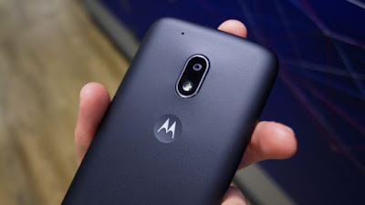
Moto G4 Play review


The Moto G4 Play just wants to have some fun. It isn't necessarily the most skilled at any one thing, but it's hard to look away from a deal this good.
Sitting at the bottom of the G4 totem pole in terms of specs, the G4 Play is generally lacking in marquee features compared to the Moto G4 and Moto G4 Plus.
But does that make it a bad phone? Nope, just one that's definitely not for everyone. Still, going for as low as $99 price point, everyone can afford this unlocked smartphone. At that, it sits at the top of the G-series in terms of value.

Moto G4 Play price and release date

Months after the Moto G4 and Moto G4 Plus hit shelves across the globe, it's now time for the G4 Play.
This budget smartphone will be available online at Best Buy, B&H, and on Motorola's own site for $149 (£129, AU$249). It can also be purchased through Amazon for the same price, or a discounted rate of $99 in the US, which will come pre-loaded with ads on the lockscreen.


Verizon will be offering the Moto G4 Play on a prepaid plan, but regardless of where you buy it, it will work with all major US carriers.

Design and display

Although this phone is targeted towards those on a budget, you wouldn't guess it just by looks alone. The Moto G4 Play looks a lot like the Moto G4, even down to the ruggedized plastic back and rounded edges. But it also takes design cues from high-end phones in the Moto family.
A few examples are the silver trimmed speaker, the deep grey trim and textured power button that are found on higher-end models like the Moto Z. Obviously, cheaper build materials are used here, but the effect is in full-force.


In terms of features, you'll find your usual suspects on the G4 Play, like a 3.5mm headphone jack, front and rear-facing cameras, and a microUSB port for charging. What you won't find are some slightly more big-ticket inclusions, like Gorilla Glass, a fingerprint reader, or a charge input with any sort of quick-charging technology built-in.
The 720p display has a pixel density of 294ppi (pixels per inch). While that's by no means impressive compared to many QHD (2,560 x 1,440) Android smartphones, it totally does the job for this smaller, much more affordable device.

Specs and performance

By the look of the Moto G4 Play, it strives to provide the essentials and not much more. And its specs tell a similar story.
Stocked with a Snapdragon 410 quad-core processor and the Adreno 306, it's the same system on a chip (SoC) that can be found in modern Android Wear smartwatches. The Moto G4 Play also comes with 2GB RAM and 16GB of onboard storage, with the option for expansion available thanks to the microSD slot.


Using the Moto G4 Play feels relatively snappy for a device at this price point, which is partially a testament to Moto's only slight modification to the stock Android experience. There are a few touches inserted into the mix, but most of them are good, like the Moto Display function, which shows you pertinent notifications when your hand hovers over the phone.
It should be mentioned that the G4 Play isn't a gaming powerhouse. One of our favorites games as of late, Giant Boulder of Death, runs smoothly, but the game more or less relies on a gyroscope, a part that this phone doesn't have. Many smartphone games rely on tilt functionality, but you won't be able to enjoy them on this phone unless they support alternate control schemes.
This aside, Moto's G4 Play should provide a generally passable experience whether you're watching a movie or playing the occasional game.


Focusing on a few other features, the Moto G4 Play features a 2,800mAh removable battery, which rests under the plastic back. It shares the rear with an 8MP sensor that has an aperture of f/2.2. If you want to shoot video, this phone can record in 1080p at 30 frames per second (FPS). Over on the front, the selfie camera is 5MP and also has an aperture of f/2.2. Again, nothing too eye-opening here, but the essentials are on the table.
We look forward to digging into some deeper testing with the Moto G4 Play, including photo samples and battery impressions.

Early verdict

The Moto G4 Play, like the other G-series phones, operates with a value-first mindset. If you're looking for the most phone for the least amount of money, you'll have a hard time finding a better deal than this.
While it's easy to think that this phone is missing some key features, it's not. That's why the Moto G4 Play is so cheap. The Moto G4 Plus, for an extra $100, packs in the fingerprint sensor, bump up in screen resolution and a Snapdragon 617. If those specs don't matter much to you, Moto's low-end G4 phone might be just what you need.

Apple Watch Series 2 review


It's been two years since the first Apple Watch was unveiled, and in that time the wearables market has changed considerably – but what can't be denied is that Tim Cook's crew made the best-selling smartwatch by some distance, and has refined that in some key areas for the Apple Watch Series 2.
That doesn't mean it was the perfect device for your wrist though – far from it. While Apple promised that its Watch would, like a 'normal' watch, continue to function well for a number of years, there were instantly some reservations about its limitations.


A single day on battery? No GPS? An initial lack of apps and, dare we say it, no obvious point to having this on your wrist? Sure, it's good to know whether someone has sent you a message worth reading, but beyond that it seemed a luxury rather than a necessity.
In the intervening two years we've seen smartwatches with three- to four-day battery life emerge, at the same time packing in GPS connectivity, advanced fitness tracking and a whole host of apps too – Apple needed to step up.


The good news is that it has, with the new device bringing a raft of new features that will make it much more exciting and attractive to prospective smartwatch wearers. Apple has also teamed up with Nike to offer a dedicated running variant of the watch, although it only brings an app and a new strap.

Apple Watch Series 2 price and release date

In terms of cost, the Apple Watch 2 price has been set at something similar to previous years, with the base Watch model costing $369 (about £275, AU$480). The original Apple Watch, now called the Apple Watch Series 1, will cost $269 (about £200, AU$350).


There's also a new ceramic version, and that's going to set you back $1249 from the start (which is an unfair £1249 in the UK and AU$1799) - it's a beautiful model, but not one that's worth that kind of money.


The Apple Watch Series 2 – thankfully – won't be subjected to the same kind of delay we had to endure in 2014 – so instead of waiting months, you'll be able to get your hands on one of these from September 16, the same day the iPhone 7 and 7 Plus go on sale.

Design

The design of the Apple Watch Series 2 hasn't really evolved too much from the original, with the same square frame encompassing the glass screen that was seen on the first Apple Watch.
It is waterproof now though, which is a big deal for people that like swimming - it's now one of the activities you can get the Watch to track from the workouts menu.
Despite the similar design, Apple hasn't said anything about the Watch 2 being a device that can last any longer than before – presumably that was 'good enough' in the brand's eyes, and now that it's a watch with GPS, there was no room to make the battery last longer.


That said, the Apple Watch was always one of the more attractive devices in the smartwatch world, so the lack of a major design upgrade this time around isn't really that much of a shock - and while it's a touch thicker, we're talking less than a millimetre compared to the previous generation.
We're still seeing the same digital crown and single button – both of which are now more useful since WatchOS 3 was unveiled. They're smooth, clear, and easy to hit when on the wrist, and while the design hasn't changed dramatically, it's what it can now do that matters.


The amount of designs seems to be limited more to the bands - the aforementioned ceramic version is the most expensive, and there are the stainless steel and aluminium options too, all with varying prices.
It looks like the hyper-expensive 'Edition' range is no more. Shame. Apple must have sold three and been able to fund the entire project for the next fifteen years.

Screen

Apple was notoriously secretive about its screen on the first Apple Watch, and with the same 38mm and 42mm sizes on offer this time around, things haven't changed.
However, the display on the first Watch was one of the best things about it, using a flexible OLED display with a high level of sharpness underneath sapphire or ion-X glass (depending on whether you go for the Sport model or not) according to DisplayMate.


The overall effect is similar on the new Apple Watch 2, with the screen remaining the same size but massively boosted when it comes to brightness - it's twice as bright and makes everything look more clear and vivid on the screen. It's also going to be excellent for bright sunshine.
Force Touch is back again, enabling you to press harder on the display to activate different elements such as changing settings – although Apple seems to have moved away from this option in the way WatchOS 3 works, instead letting you do a lot of things with swipes.


We were hoping for an 'always on' display, but once again you'll need to raise it to see what time it is. Sadly Apple couldn't figure this one out in the way other watches have managed to.

Fitness

The big changes in the Apple Watch 2 are on the fitness side, where GPS being on board has enabled it to do more autonomously from your iPhone. Apple's got some interesting changes here, with the water resistance the main change.
That means you can now track your swims in the pool or in open water - and Apple's Jeff Williams lambasted current sporting watches as too complex, not able to give you the notifications you want when you want them.


While the changes have been welcome on the Apple Watch Series 2, there's not a lot of information that can really be used well here. For instance, the Apple Watch can work out the size of your pool rather than you having to input it. Fine, that makes sense - it can also learn your stroke length over time to work out how far you've gone.
But what if it's wrong and doesn't track the distance correctly? How does it know how long your stroke is? The simplicity of the watch is also its greatest drawback, as the inability to fiddle with settings is something of an issue if the results are wrong. And if you can't trust what you're seeing, then you'll come to disregard it as a training tool.


Apple went big on saying this was one of the best watches for runners as well, with the GPS inside being able to track you accurately without the phone needed. It's a possibility, but Nike+ was lauded as the most fancy app on offer for the new Watch, and the 'advanced mode' there could basically show you distance, time or BPM from your heart rate.
The last one isn't even really that accurate - the heart rate monitor hasn't changed on the new Apple Watch, and that means it won't be much good for running still.
This needs a good testing before we can properly say whether or not it's any good for a runner - but I feel that it's still a bit too simplistic.

Battery

The battery life of the Apple Watch was one of the contentious elements, and that will actually drop ever so slightly when WatchOS 3 hits – the new operating system drains things a touch more thanks to the dock of apps kept in the background.


However, the drop will be minimal thanks to the more efficient way the platform works (and the lack of swipes needed to get to your favorite stuff), and Apple's extended battery life slightly in the Watch 2.
However, there's not the big change we were expecting here – Apple isn't suddenly managing to get three or four days between charges, and is miles away from the 10 days that devices like the Pebble 2 can manage with its low-power E-ink display.


Apple's stayed worryingly coy on the subject of battery life, so it's assumed that all-day battery life is once again on offer - with GPS on board, it'll be interesting to see how well that can last if you still want to use it as a smartwatch too.

Early verdict

The big question is whether these changes are enough – sure, the fitness credentials are good, and a solid upgrade, but these are the things we were hoping to see last time around, rather than having to wait two years for.
But then again, the smartwatch market is incredibly turbulent, and while Apple never disclosed sales figures of its first Watch, it was certainly the best-selling device of its kind by an absolute street.
The Apple Watch Series 2 builds on that success, comes with water resistance and fitness smarts and a brighter, more useful screen – but it's iterative again.
That said, the most exciting thing is going to be seeing how these new fitness elements work day to day – and we'll be bringing you one of the most in-depth reviews on the web very soon.

Fossil Q Marshal review


The Fossil Q Marshal, one of two new Android Wear smartwatches launched by the firm at IFA 2016, sports a rugged, yet stylish design making it one of the best looking wearables currently around.
Prices start at $275 (around £200, AU$390) and increase if you fancy spending a little extra on a leather or stainless steel strap versus the entry level silicone band.
While its sister product, the Q Wander, is aimed mainly at females although Fossil does stress it's still a unisex product, the more brutish design of the Fossil Q Marshal gives it a decidedly masculine look, not to mention extra bulk which means it takes up more of your wrist.


The chunky bezel round the circular display of the Q Marshal looks like it should rotate – like the bezel of the Samsung Gear S3 Classic – but it doesn't. You can't spin the crown button either, but we tried several times to do just that as its style is the same as on a traditional timepiece.
While it would have been nice if these parts did move, it's not a problem that they don't and the fact we were driven to try and move them shows just how well Fossil has transitioned its watch design into its latest smartwatch.
It looks and feels solid, with a generous depth similar to that of normal watches. On the wrist it's one of the few smartwatches which could be mistaken for a dumb watch – that is until the backlit display springs into life.


The screen is bright and clear, making text easy to read, although the Marshal suffers from the "flat tyre" effect, with the bottom portion of the circle cut away to make room for sensors. It's not a big issue, but it's a shame that it's not a full circle.
Round the back a plastic rear to the Q Marshal sits against your skin. There's no heart rate monitor here, but it is water resistant so you don't need to take it off when you get in the shower.
You've also got the choice of four colors for the Q Marshal, grey, silver, gold and navy, while the 22mm straps are incredibly easy to swap. Fossil offers a wide selection of bands in a variety of colors and styles with three core materials at the core: silicone, leather and stainless steel.
On screen Android Wear operates in the same way it does on any other smartwatch using the software. Fossil has given you a selection of its own watch faces as well as a range of Google's – but it's the performance where a difference can be seen.


The Fossil Q Marshal houses a Snapdragon 2100 processor at its core, an upgrade over the chip found in its predecessor, the Q Founder.
That means navigation is slicker, applications open faster and the Q Marshal is just simply an all-round better performer.
Charging the Q Marshal is easy, with an Apple Watch-esque magnetic charging cable which clings onto the rear of the watch.


Early verdict

The Fossil Q Marshal is a great looking smartwatch, and with the added performance boost of the Snapdragon 2100 processor it's making a strong play in the Android Wear field.
It's a genuine competitor to the Apple Watch and new Samsung Gear S3, and for those looking for something a bit different, and cool, the Q Marshal is very enticing.

Jide Remix Mini review


The history of alternative operating systems is littered with dead bodies from big and small companies – from the mighty IBM and the mightier Intel to smaller corpses (Lindows anyone?), there have been dozens of companies trying to break the stranglehold of Microsoft back in the day, then Google's Android later on.
Failure to do so could vaporise tens of billions of pounds off a company's value; Nokia and Motorola know a thing or two about that.
Now, a small company called Jide is trying to challenge both Microsoft and Google with a little operating system called Remix OS. In reality, the latter is not an entirely new venture but is, in fact, based on Google's Android which is itself an open source project.
We came across Jide and Remix OS a few weeks ago when reviewing the Onda OBook 10 SE (check the review for a bit more background) and this time around, Gearbest sent us a sample of Jide's very own take on the modern computer, theRemix Mini PC which is the product of a successful Kickstarter campaign.
At just over £40 including delivery (around $52, AU$70), it is one of the cheapest mini PCs on the market, regardless of the OS, to offer 2GB of RAM. Note that if you're thinking of a purchase, we strongly advise you to read our article on thepros and cons of buying from Chinese retailers (and generally speaking, outside of the UK).
The Remix Mini looks like a pebble from afar, with a curved body devoid of any edges as such. Black in colour, it comes with a 10W (5V2A) power supply unit and an HDMI cable as well as a couple of leaflets.


There's a green status LED at the front, a pair of USB 2.0 ports on the back together with a full-size HDMI connector, an audio port, a microSD card slot and a 10/100Mbps Ethernet port.
Our model came with 2GB of RAM and 16GB on-board storage. A cheaper variant with half the memory and half the storage is also available although we'd strongly advise you to avoid it.
Both models come with a quad-core Allwinner system-on-chip based on ARM's Cortex-A53 technology and clocked at 1.2GHz. Because the device doesn't have an active fan, it ran a tad warm in operation; although not to any worrying extent.


As expected, you get 802.11n Wi-Fi as well as Bluetooth 4.0. The Remix Mini supports 4K decoding but since it can only output at full HD, this won't matter much.
Using the device was very intuitive – just plug in everything and switch it on by tapping on the Remix logo on top. Jide opted for a capacitive button which we disliked thoroughly as merely touching the logo would send the device to sleep.
We updated the Remix OS to version 2.0.604 (based on Android 5.1) and there is an option to enrol in a scheme similar to Microsoft's Windows Insider program, allowing you to beta test the operating system. The update process took minutes rather than hours as some reported online, with a fairly straightforward setup.
Compared to stock Android, Remix OS offers useful features such as native multi-tasking, a file manager, a taskbar, an option bar on the right, right click menu, shortcuts and a start menu that make it look more like Windows than anything produced by Google.


Windows can be resized, minimised and maximised – snap to borders and Windows-based resizing shortcuts didn't work, though. Applications bundled included the usual suspects from Google (Play Store, Movies, Docs, Sheets, Gmail and Chrome) as well as a flurry of others from partners, one of which is Kodi.
Performance was acceptable and, in a thin client configuration, would be more than adequate. Even on a full HD display, light web browsing or playing YouTube videos proved to be as intuitive as on an Android tablet, except you do it with a keyboard and a mouse rather than a touchscreen display.

Early verdict

Devices like the Remix Mini could transform Google's Android into a very cheap, almost free alternative to Windows for very small businesses that require internet access or operate mostly in the cloud.
The fact that it can be plugged into most recent displays with an HDMI connector paves the way for some interesting configurations like powering a digital signage solution or a standalone kiosk. Having a wired connectivity option (hello Ethernet port) and no fans or vents does help as well.
It's hard to fault the Remix Mini at this price – especially with the desktop experience – and the productivity aspect is particularly enticing if you are already using Google Apps, Microsoft Office Mobile or OfficeSuite.
That said, Chrome OS is fairly similar to Remix OS – both are designed as 'desktopified' Android – and while devices running the former might not be as affordable as the Remix Mini, the fact is that you can go in a high street store and buy one like the Lenovo N22 Chromebook.
For small businesses, there's also the appeal of having a company like Google providing support for Chrome OS rather than a much smaller company in a far, far away country.